

The Rockport House
Brand Identity

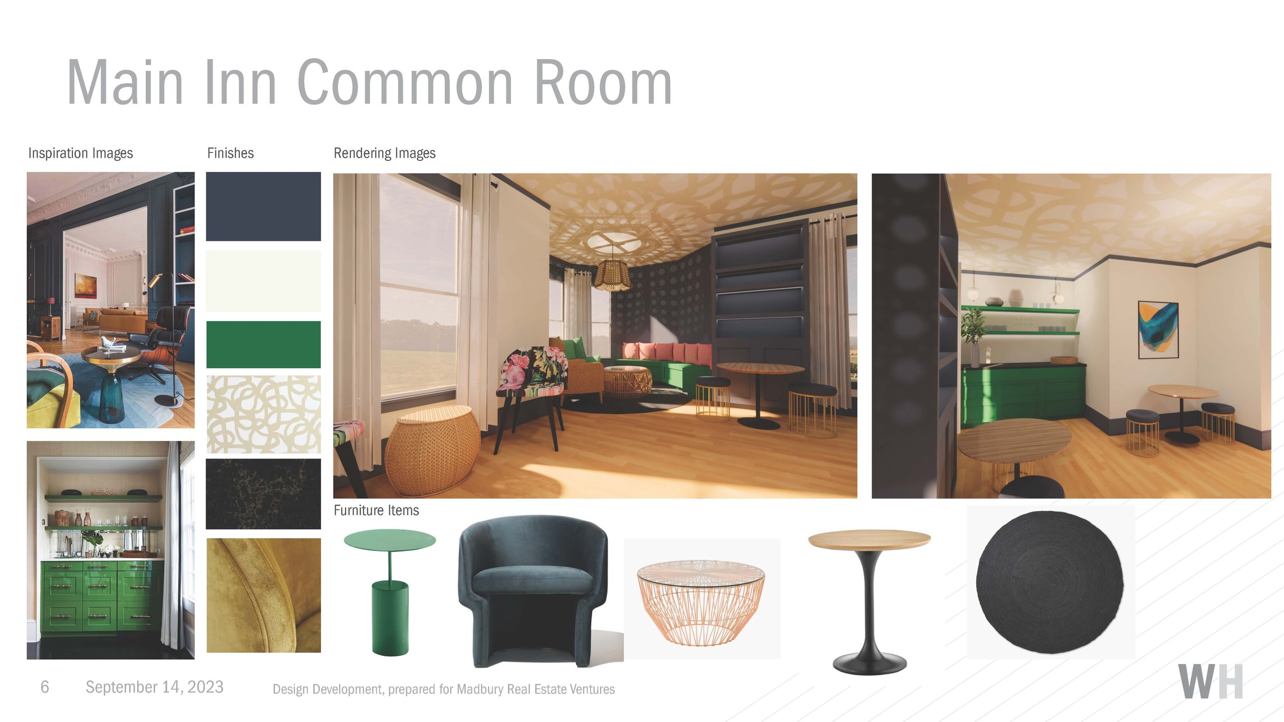
I was asked by a former client who is expanding into the hospitality industry to design branding for their newest venture. Located in Rockport, Massachusetts, The Rockport House is a renovated Victorian bed & breakfast providing a luxurious, serene weekend escape for the art lover. The inn itself is highly stylized – unique and not for the mass market. The Rockport House’s target customer are eccentric older couples visiting Rockport for its ebullient art scene. Therefore, I took inspiration from The Rockport House’s art deco interior as well as New England colonial and coastal motifs.

Brand Guidelines
A standard 12-page brand guidelines book explaining the typography, color codes, logo spacing and usage rules moving forward.


Interior Design Inspiration
The logo design leans highly art-deco, pulling from the fixture choices and wallpaper adorning the inn.


Process Work
We went through five rounds of revisions before landing on the final branding. Here are some of my favroite concept explorations pulls from the drafts

This from round one of the logo development stage. The final wordmark is included in the first round of art deco explorations I developed here

A separate exploration of accented leaf motif used in the final logo. This icon was developed from the specific art deco interior design details throughout the inn (shows on the right) as well as from classic art deco patterns

This option, also presented in the first round, was ultimately scrapped because it was missing the warm feel the client wanted to portray in the logo type.
This logo concept was one of my favorites not because of its final design, but because of its source of inspiration. Rockport, MA is most famous for it’s galleries filled with historical Folly Cove prints.

The Folly Cove Designers were a guild of women artisans who worked in Cape Ann, Massachusetts, and designed for Schumacher during the 1940s and ’50s. The mostly self-taught designers produced charming, unpretentious designs that were first sketched and carved into linoleum blocks, then hand-printed onto textiles and other materials. Largely inspired by their New England surroundings, the group was known for cheerful, picturesque scenes from country life and a flat, folksy aesthetic.
The logo motif features two hummingbirds, which are found throughout the famous Folly Cove prints. The textured diamond logo is created from the negative space between the birds’ wings.

In a later round, once the client had decided on a design direction, I demonstrated the usage of the full art deco wordmark. This demonstration shows the logo adapted for room numbers, which we later developed for official use as placards throughout the inn.
Onsite Signage
I partnered with local vendors to create customized signage for all areas of the hotel. This included a colonial-style wooden sign out front which is easily visible from the road as well as internal signage for room numbers, the laundry room, parking and various guest houses around the property. Each type of signage had to be contracted through a different vendor and had to be adaptable to their specific specs. I also designed the large entry-way mural inspired by the hummingbird motif which is so popular in the historic Rockport Folly Cove prints.


Print Materials
Additionally, I developed all the print marketing and promotional materials for The Rockport House spanning business cards, coasters, brochures, rack cards, guest guide books, and table tents .


